10 reasons to throw away a logo!

Your logo will definitely perfect, or at least good, only in case you create the logo yourself and don’t make typical mistakes that can cause an unrecoverable fiasco.
What are the mistakes?
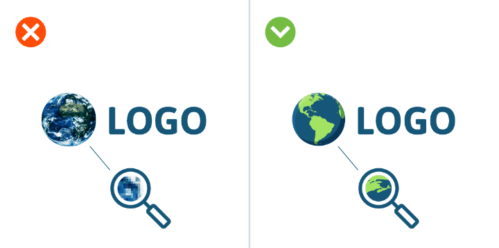
1. Raster images
Every professional custom logo designer knows that this kind of images shouldn’t be used. And what about the beginners, who dare to create logos themselves? There is a chance that they have no idea that the raster image becomes a “visual mosaic nonsense”, if it is zoomed in. It will deal a crushing blow to the reputation of the logo owner. The reason for this metamorphosis is quite obvious! The raster image consists of a certain number of pixels. When you zoom it in, the size of pixels increases as well, the boundaries of objects become blurred, mipmapping and clearness of the image are lost permanently.
Vector graphics and, of course, using the programs enabling you to work with it, will help solve the problem with the head held high. Let me introduce you Adobe Illustrator or Corel Draw. They enable you to scale the image and succeed in editing it.
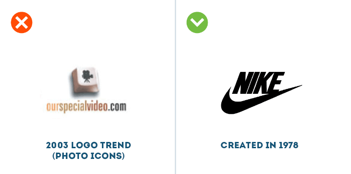
2. Chasing trends
Most trends that succeed at the market sooner or later become the ultimate clichés. This reveals that their users are mediocre imitators of someone else’s ideas. And by the way, unfortunately, these ideas become old-fashioned. The truth is that a really good logo should be viable.
Besides, its lifespan should be maximum. Chasing trends never leads to the creation of a truly unique illustration of the trademark. Therefore, when trying to create the logo yourself or using the logo design generator, you shouldn’t look to newfangled trends.
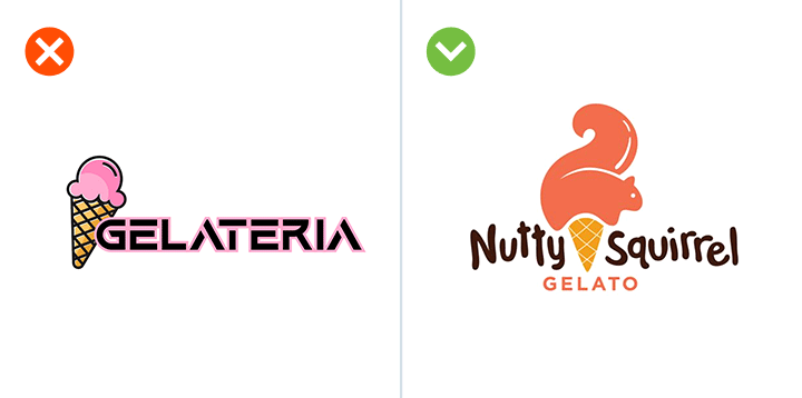
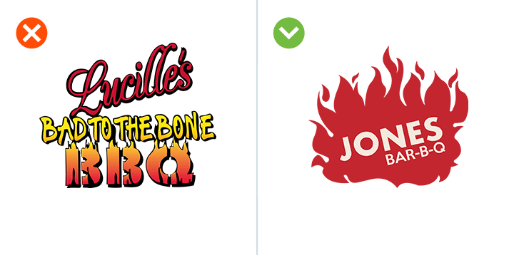
3. Complexity multiplied by complexity equals catastrophe
Don’t even try to make your logo reflect everything you’ve been dreaming about and striving after, as well as the methods you intend to use to achieve your goals. A palette of useless details makes the logo archaic, hopelessly outdated, old-fashioned. It causes mishaps. If such a logo is zoomed out and placed, for example, on your business card:
- best case scenario: it will be impossible to read it
- worst case scenario: it will be misunderstood

4. Color dependency
There are a lot of great logos that can show their “splendor” exclusively in color. And they look completely freaky in black and white. But it must be the other way around. Discolor your logo. Bring it to a classic “black and white” test.
And you will learn understand a very simple truth almost at once: if you decide to create the logo yourself, you should start with a black and white version, ignoring colors.

5. Font is no good!
Of course, the font you choose should correspond to the concept of your logo. Nevertheless, it shouldn’t be the maximum correspondence. As a result of complete matching the font and the image will either merge or fight with each other. To reach harmony means to find the right balance “between the letters and the image”. In this case everything will be alright! If you create the logo using our service, you can be sure that the font will match the sign perfectly, because professional custom logo designers dealt with it.
6. Logo “with the soul component”
The brand logo generator helps prevent a huge mistake, which is often made by people, who are in love with their work. And more than that – they are in love with themselves. There are gazillions of examples of logos that failed. “Disaster developers” used their favorite colors and fonts, while designing those logos. In practice, this leads to the situation that the font you like is used for the company logo, and it doesn’t correspond to the activity area of the company.

7. Typographic mistake
Before creating the logo yourself, you really need to study the key nuances of the printing business. We’ve already mentioned a couple of times that you shouldn’t use more than 1-2 fonts. Forget about pretentiousness! But, at the same time, don’t be too predictable. Follow dimension-interval aspects strictly.
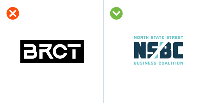
8. Beware! Abbreviation!
It’s almost impossible to reduce a compound name of the company to two or three letters and convey its philosophy and principles, direction and peculiar features by means of the logo. Be careful with this aspect, if you want to create an online logo using the logo design generator or develop it yourself.
One can object to us: there are a lot of companies, abbreviations of which are well known and understood all over the world. Say, for example, IBM or HP. Believe me, they “descended from the top” to the level of abbreviation after many, many years on their way to success.
9. Avoid clichés!
Just avoid clichés and achieve authenticity. But don’t become an “egghead snob” and don’t make yourself the only person, who understands the meaning of your logo.

10. Don’t steal
“Editing” another person’s logo, modifying it slightly and presenting it as if it were yours is the most ridiculous idea that can come to your mind. It all can lead to bad consequences in every respect.
Don’t make mistakes. Keep them in mind. And you will create a good logo yourself or with he help of our program