Logo shape language is an invisible dialogue!

Providing you with a unique opportunity to create a logo online with the help of our brand logo maker, we’d like to tell you about the logo shape, which often stays terra incognita for user.
So, what does the shape of the chosen logotype reveal to a potential user?
And which is the right way to use it to get out the key idea, the so-called “message”?
1. Circle
Circular logo should be used in case you want to express the idea of friendship, unity, to state that the firm was started as a result of combined efforts of a group of companies or persons. The circle is a good choice for associations, consortiums. This is the symbol of the international element (the Earth is spherical!), peacefulness, movement (remember the logo of Tour de France!).
2. Ring
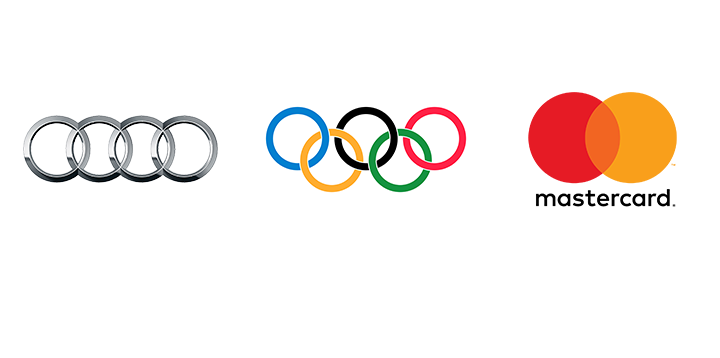
Its meaning is rather similar to the circle! The entwinement of wheels means determination and power. Symbols of Audi and the Olympic Games are the most famous rings in the world. The ring in the logotype may represent the team cohesion and st4rength, neat style of work and business activity.
3. Curve
Perfect and straight lines shouldn’t be considered the only ones that have the right to exist. Intentional “flaws” and curves are a great opportunity to show the company’s level of thinking outside the box, strategic planning and logic of managers are able to adapt to volatile suggested circumstances of the reality.
4. Square
One of the most mysterious shapes in the world of logotypes highlights consistency and stability of the company. The square is a hidden geometric metaphor. It may allusively represent the ambition of the team that aspires to provide services, the quality of which h is squared.
5. Triangle
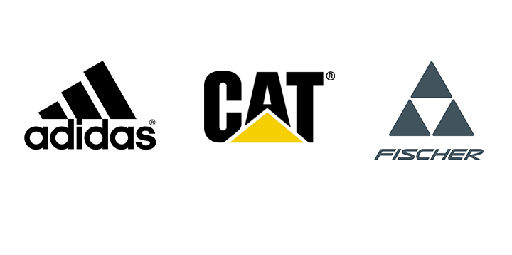
And what about the geometric mark that resembles the Great Pyramid of Cheops? It was used to create the logos of rather established companies, which have become popular with customers for years of profitable and productive activity.
ТThe triangle is the embodiment of knowledge and power, as well as the symbol, which stands for the fact that such things as corporate culture, spirituality and creativity are appreciated at the enterprise, which chose “the logo with three angles”.
6. Lines
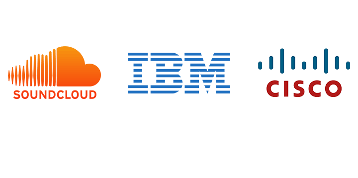
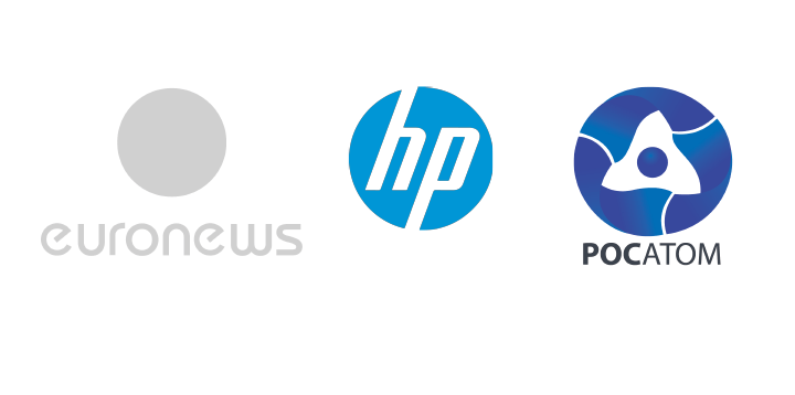
Straight – horizontal and vertical! – lines are far from being banality. Speaking the shape language the latter ones represent the sample of durability and endurance. The given example of Soundcloud, in which the cloud representing the creative element goes with the sharpness of straight vertical lines, is a good sample of tandem of incongruous things – that is the certainty of the chosen direction and the infinite stretch of imagination.
Straight horizontal lines look rather interesting too. Reliability in hi-tech style, confidence and tranquility.
7. Egg?
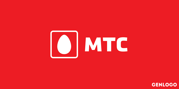
There is much speculation that the MTS logo is an egg. It’s an absolutely wrong suggestion. The shape of the egg is depicted there. It is a rather good and meaningful symbol of the primal element of all outdoor. The logo shaped as the egg means the life spring, source of the universe (and v y no means Humpty-Dumpty that is about to fall off the pipe). It’s simple, universal, and smashing.
8. Human face logo
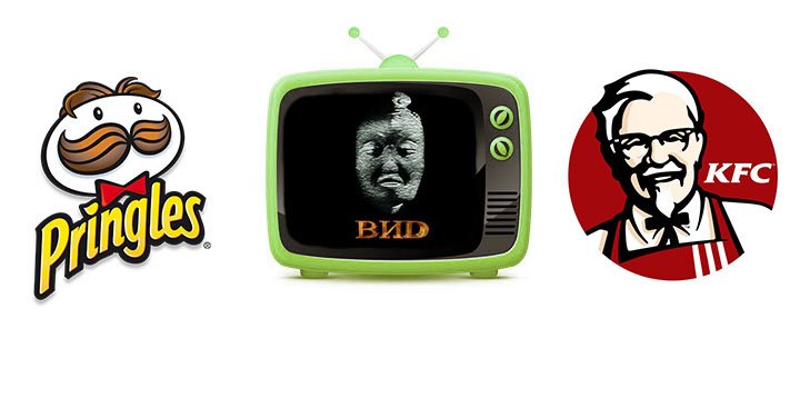
Despite the fact that VID Company had its moment in the 1990s, a lot of viewers remember this unbelievable face with an awful grimace and… a toad with three paws on its head. What did the philosopher Guo Xiang have to do with TV? It’s a dead ender. But the only thing we know for sure is that the logo suggested by the wife of one of the company’s founders, the Orientalist scholar, was changed several times, but the audience kept it in memory.
The face-shaped logo is an unhacked and rather expressive idea. It will be remembered for sure. For customers usually keep faces in memory.
9. It’s not a logo, it’s a beast!
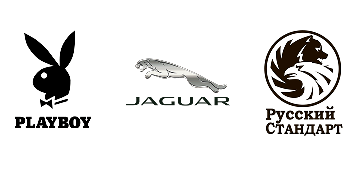
Beasts, their traits, contours may be a perfect image for the prevailing features and peculiarities of your derivative conception. Remember Metro Goldwyn Mayer and its memorable “pussy cat”, the loud yawn of which is the opening act for every showing, hinting that you won’t get bored and yawn.
And what about a playful Playboy bunny? And a wild beast show of Russian Standard?
Think about it! Who are you in the business world? A wolf? A cheetah? Or maybe a kangaroo? It’s your choice!
10. Abstraction is the mother of mystery!
Think about it! Thousands of logo creators tinker with brand images, trying to add a “higher meaning” and “irreproachable logic” to them. And no one tries to offer the potential customers to find this meaning themselves. The customer in turn will see the abstraction like this and remember you as a very extraordinary producer. And we believe they will be charmed by the logo and, of course, by the quality of the services rendered.