Font for the logo. The agony of choosing.
How to choose a font and make a logo yourself?
His Majesty Font is one of the key components of a good (and even bad) logo. The font is the one that reveals the message of the designer, who took in the right spirit of the customer, the potential consumer audience.
When you choose the font, you should at least stick to the principles, if not the rules. But if you don’t want to get stuck in the professional terminology, you should get acquainted with it, at least remotely. This is the way you get the answer to the question – how can you make a logo yourself?
What can these “cherished letters” can be?
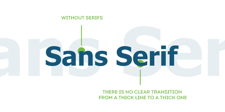
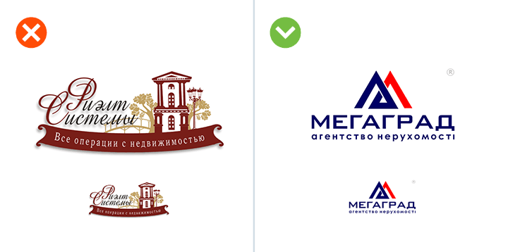
There are the fonts with the so-called “serifs”.

Brilliant professionals designers have such a widely spread opinion that the “serif” font help keep the viewer focused on the line. The transition from thicker lines to thinner ones is the key feature of such a font.
Here is the example:
Sans Serif
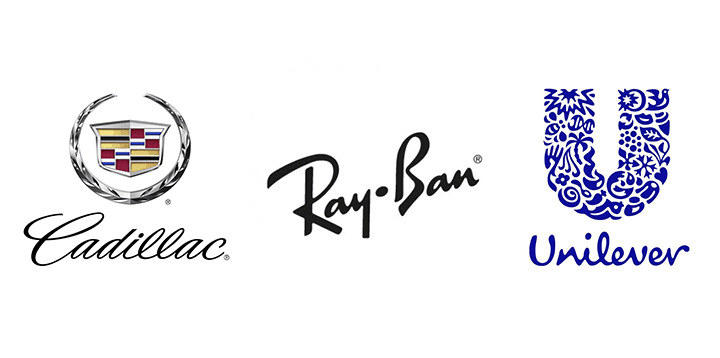
As opposed to them, there are fonts without serifs. However, it adds some charm to them. Have a look at this aesthetics of right angles, clear, straight lines. It has the right to exist!
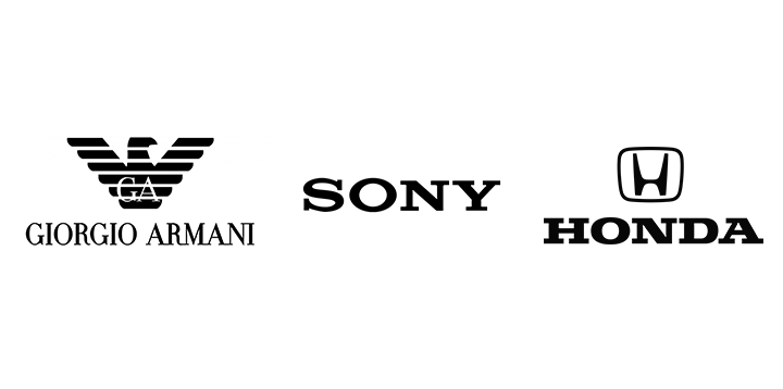
Where can this font be used? Everywhere! Most world brands use Sans Serif in their logos. It is indispensible in cases, when you need to highlight and emphasize the element of business style.
Italics
And what about italics? It’s complicated. On the one hand, this font can put a focus on a special “humane attitude” of the brand. On the other hand, the italics are the font that claims grace and luxury sometimes. Look at Cadillac, for example.
It looks like a stylish signature of a millionaire, who doesn’t care about the fact that his last name will or will not be read, doesn’t it?
Archaic font
Have you ever noticed that we live in strange times – nowadays, there are minimum contemporary things. They broadcast TV shows about the Soviet days. The heroes of the past are trending. Let’s take a look at GUM Department Store! They will feed us with the Soviet ice-cream. We can have tea in the Soviet canteens. But the prices, of course, are far from the ones they had in the Soviet Union.
The archaic font of a damaged typewriter is used in the logotype. Why not? If you want to emphasize the fact that you’ve been working in this field since time immemorial, it will be perfect. It’s rather readable.
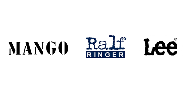
Fantasy font
And finally, there is the fantasy font with its truly unlimited features.
There are millions of fantasy font options. Hence, there are millions ways to impress the potential customer. It’s easy to stand out of the competitors with the right approach to using the logo with such a font. What would you li8ke to see in the logo? Fun or romance? Solemnity or a bit of pathos? Element of history or aggressive hi-tech?
A new interesting font occurs almost every day. But it’s doesn’t bring joy to users for a long period of time, since people get bored in this case faster than in case of a popular ringtone.
So, how can the right font be chosen?
If you use the brand logo generator presented on our site, you won’t need to trouble your head about this question. Whichever sign you choose, the best font has already been chosen. But still there are several general rules that should be revealed:
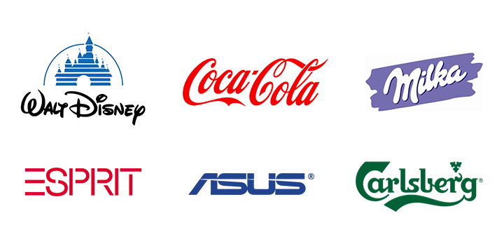
- The font must correspond to the business area. Imagine the bank with funny “Disney fonts”. Will the potential customer trust this bank? No. He will be scared that the bank will arrange a “funny ride” on the “financial merry-go-round”. And now imagine the “Kiddie Rides” sign that has the logo as if it were on Linked In. The easiest way is to choose a nice font for business is to go directly to the competitors’ sites. Thus, you’ll see, which fonts are popular in the chosen business area.
- The font readability must be excellent a priori. Zoom out your logo to the fullest. Can the font still be easily read? You made the right choice, if it is so.
- Type several lines of a plain text. Check the clarity of the font approximately. Do the letters blend? What happens if you zoom out the text? Does it look good? Can it be read without efforts? Congratulations.
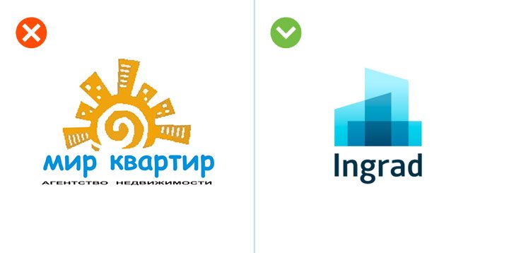
- Does the font correspond to other elements of the logo? There is a widely spread image: an artful icon and a massive font that doesn’t correspond to it. Such a logotype may be treated with irony.
- Did you find several good fonts instead of one? We are happy for you. But you shouldn’t use more than one font in one logo. It’s appropriate to use not more than two fonts. Nevertheless, two fonts are too many by modern standards.

- How typical is your font? Is it a clich?? If you use Comic Sans to make an inscription on the logo, which will belong to the company that is involved with entertainment and comedy, you are not quite right.
- You shouldn’t turn the process of choosing the logo font into “chasing the trend”. You don’t have to use the font that occurred yesterday or is all the rage. Sooner or later everything new becomes old.
You don’t want to waste your time choosing fonts, do you? Try to choose the logo online on our site, where a unique logo design generator was developed.
Good luck!