How do you develop a company logo and choose the RIGHT color?
How do you develop a brand logo of your company, following self-presentation algorithms? Customers, who offer a custom logo designer to choose any “brisky” color, sometimes fail to understand that the correctly chosen color range of the corporate style is the most important key element of a successful brand.
If you try to develop a brand logo online (to develop it yourself using our online service), it is important to understand that each color offered by us can:
- - trigger very specific emotions
- - develop associations
- - have a powerful psychological influence on the potential client
The question is as follows: what should these associations be like and what impact should be encrypted in the color palette reflecting the customer’s individuality of the logo?
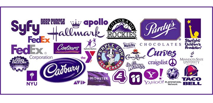
Martin Christie (one of the top specialists of Logo Design London) claimed that the correct understanding of the brand logo and the psychology of its color by the logo creator is the crucial factor in the feasibility of the logotype.
The researches testify that 1.5 minutes are enough to form a comprehensive opinion about a person or a product.
Surveys show that the color is the key criterion for 60-90% of potential consumers. Thus, it is well documented that “racism” is defeated in word, but not in action: people choose everything, considering the color. It is important to understand this fact for those who want to develop the logo online.
So!
How do you define the “color orientation” of your company?
One of the simplest tips: follow the fashion! Monitoring good logotypes that have occurred in recent years clearly shows that in each season has its trendy color
You should “google” the shades that are trendy this year. It’s a good idea, however, it is more suitable for youth brands that can afford to update their “color tone” every 1-2 years. What should others choose? Using gradients in the logo? Multicolor? Thant’s an option!
Nevertheless, initially you can start not from fashion, but from a sudden understanding that “Classics is eternal!” Indeed: our experience and many years of practice show that the classic colors – black and burgundy, bronze and dark blue – are always relevant. However, the decision to develop the logotype using these colors can be reckless: they will perfectly emphasize the status of a company that has a long-standing reputation, but in other cases they may be a little inappropriate.
You should proceed from self-presentation.
If you want to show that you are experienced and adhere to the traditions, you should use the classical colors. And if you are strict enough, but at the same time modern, you should use more vibrant shades. If you present your company as a young and modern enterprise, you should pay attention to multicolor or different shades.
But it is extremely important not to “go too far” in all these color searches – not to set up a supermarket selling goods for children under a black and white signboard, which is more appropriate for a store of funeral supplies, or a drugstore in jaw-dropping shades of pink, which are much more appropriate for a sex shop.
The color of the corporate style is very important, which means that before you start the online logo design tool, you have to master the “language of colors”!
Blue stands for honesty and reliability, but there is an element of coolness.

Black has a special meaning – it means best-in-class authority, luxury, classics, grand style, but at the same time it is the “eternal singer” of gloom.

Red means a combination of power and passion, delight and love, but simultaneously it can be an alarm?

Yellow used in the logo is a symbol of optimism and creativity of the enterprise, however, its excess can signal about the need to be cautious.

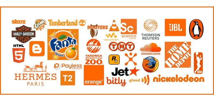
What are the peculiarities of orange? It is a real catch for those who develop the logo online. This color is happy and sunny, promoting appetite, relevant in retail, encouraging to action. But at the same time... it is often a warning (which is natural – it’s a shade of red).
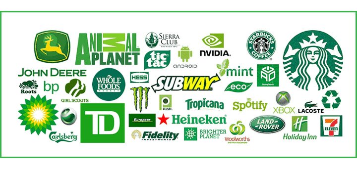
And what about green? It is the color of freshness, calmness, life, good neighborliness with the environment, hospitality, kindness, quality. That’s why it is used by those who want to make a logo for a company that produces environmentally friendly products.
What do you liken purple to? If you use it while developing the logotype online, remember that it surprisingly combines majesty with pomposity. Do you really need them in your logo?
It all depends on your self-presentation, think of how you want to be introduced to the client? Should there be joy and emotion or confidence and premium class?
But the main question is still unanswered – What color should be the key one when developing the logo online?
Choosing the color that reflects the essence of the product or the service you provide in the best possible way is a meditative process, in which several following factors should be considered:
- Suggested taste preferences of customers. Suppose you set up a beauty parlor. Female colors may prevail in its logo. The provision of medical services, on the contrary, implies a complete rejection of “glaring” shades. The development of a historical brand accepts the presence of classic black or brown tones.
- Background In a real (not virtual) world, the logo will surely be placed with background. It can be a wall, a door – their “color factor” by no means can be disregarded, solving the issue of the palette of the logo. Moreover, you need to pay attention to the “color combinations” of the environment, in which the logo will be placed.
- Monochrome and multicolored. Don’t bank on the palette too much. When choosing colors, it is necessary to consider that the logo should look good in a one-color version. That’s why it’s better to develop it in vector format.
And here is one more interesting point. When you set up a company abroad, remember that some colors in the logo can be “taboo”. White is a symbol of business purity and even “sterility” in our country. But in Asia, this is the color of none-existence. Don’t miss the target audience and its perception!
Good luck with developing the logo online!