Primitivism as a fashion trend.
Those “memorable” times, when the level of “sophistication” of the logotype was a kind of a key to its success, sank into oblivion. Nowadays, we are amazed to watch people, who literally, not figuratively, try to be like Kasimir Malevich, making good money.
The legendary follower of Suprematism used “black squares”, which still remain a perfect example of genuine art. And Art. Lebedev Studio is famous for making a fair amount of money for developing… a blue rhombus..
Branding development or regression?
There are fewer and fewer logos that have been thoroughly elaborated by the best designer minds and can boast of their sophisticated ingenuity. Minimalism is one of the key trends of contemporary branding. When the customers face it, they can exclaim: “The service provider screwed up!”. Or, alternatively, a thought that the automatic logo design tool was used for creating the logo.
Such a response is typical because nowadays the audience is in the so-called “phase of admitting the minimalistic trend”, deprived of a usual bulge and the palette of all kinds of shading.
What is the response of designers?
Nowadays, a lot of design luminaries often say that allegedly all these “gimmicks” are desperately old-fashioned. Countless “bells and whistles” in logotypes are lugubrious preserve of those who have primitive mindset and are ready to pay for “the image”, instead of “the product”.
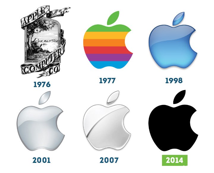
Trace the evolution of the most famous brand in the world – Apple. Is the dynamics of development or the “regression paradigm” shown to us? Everyone will have their own answer.
But the nature of the “logo-evolution” of Apple is easy to trace back. It starts with a sophisticated image depicting the “window to the world”, and it ends with a well-known bitten fruit, which lost its bulge and three-dimensionality it used to have before.
Contemporary “flat” design conquers spaces!
While the customer is trying to figure out the “truth”, trying to become cognizant of the fact that the visual embodiment is “deeply secondary” and the idea and mechanics of the logo work as a product is “deeply primary”, the objective reality tells us that the simplification trend has existed for at least 65 years.
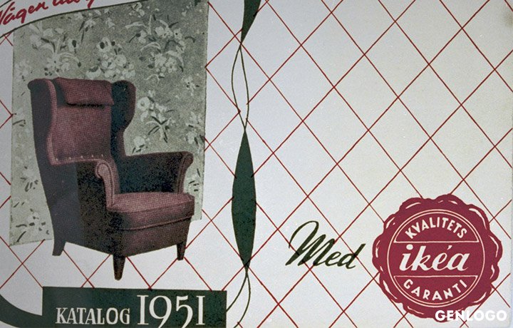
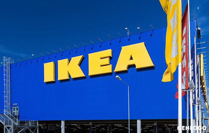
Who hasn’t been to IKEA? If you are a long-liver and visited it in 1951, you could see this sophisticated picture..
And what about now? The modern logo wasn’t created yesterday. It was developed 35 years ago. But it is laconic, just like the breakfast offered by Ural Airlines.
Needless designations, word forms, images in the logotype become things of the past.
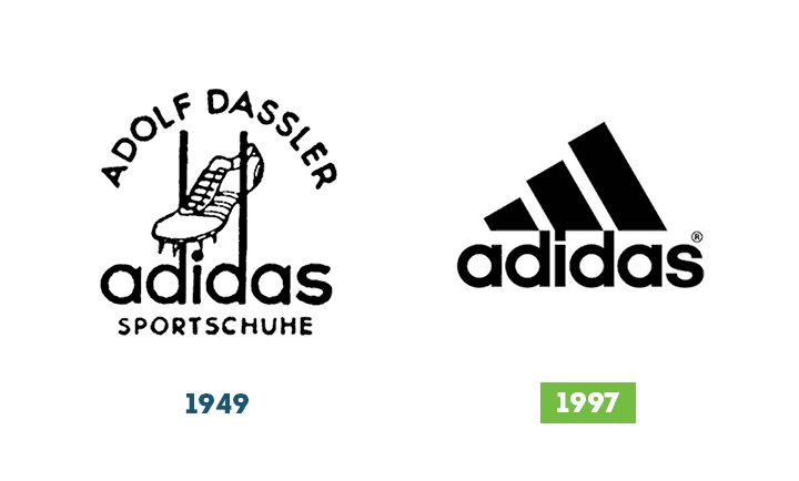
Here is the legendary Adidas in past and present:
What are the key drives of the minimalistic “trend”?
- one font, a couple of fonts at most but not a three fonts
- no compound images that resemble knights’ coats of arms
- emphasized versatility: the image should look good on T-shirts as well as on planes
- prominence – in the past, flatness - today
- minimum details, maximum simplicity
- ornamentation is excess, functionality rocks!
And what will happen tomorrow?
It’s no secret that the Era of Blockchain is coming inevitably. And automation, which has already been replacing salesmen with vending machines, will go further and replace designers with logo design tools.
Indeed. Artistic sophistication is no longer on trend. And “products combining functionality and pragmatism” are the most popular. So, we could try to abandon the designer’s work and use the online logo design generator?
Fear of getting a “desperately soulless” product restrains a potential user, who needs “hand made”. Oh well!
You are welcome!Our unique collection of logos was created by professional designers without using the generally available “logo-slag” bases.
We can sell you a logo for a song right now. And tomorrow you will be able to enter the market with your head – sorry! – your logo – up high.
Go for it!