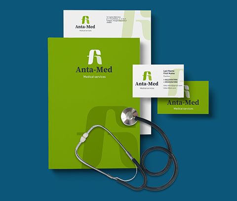
Make a logo for the clinic in 5 clicks!
The field of medicine is always special, because it is about health and sometimes about saving lives. Here you need to be careful in choosing a medical logo, here a certain restraint and friendliness is important. We advise you to avoid all sorts of clichés: "cross", "sign of medicine", etc. Yes, they are also appropriate, but in an interesting performance. Abstract logos that symbolize health, growth, activity or manufacturability are well suited for this area. After the logo, you can create a corporate identity and brand book for the medical center.

Clinic or medical institution logo
The field of medicine is not easy, in addition to many competitors, it is important to adhere to a business style, without unnecessary 'monograms' and 'pathos', everything should be clear and modern.

How to make a logo for a clinic?
In our constructor you can create a logo online by yourself. But it's worth thinking about associations.
Here are a few, in our opinion, the TOP 3 relevant associations that a medical logo should cause:
1. Safety
The logo should breathe with security, with the feeling that you are in good hands.
2. Experience
It is quite difficult to reflect this association in a logo, but nonetheless. This can be expressed in a readable, austere font, high-quality graphics, or the year of foundation can be reflected in the slogan.
3. Trust.
It is about health, here trust should be at the maximum level. A quality logo will increase trust.
You can make a professional logo using our service, because we have already selected the perfect combination of fonts, images and colors for you.

How to choose the right sign?
As we wrote above, the logo should be slightly restrained, clear, readable, concise, in other words, a kind of 'European' design. Clean and rich colors, modern graphics.


